Sunday, December 16

Possible Photos Of Cover Artist To Include...

I like this image because it represents my models character a unique artist who is not afraid to be a bit different. I like the positioning of her hands however it may be unclear that it is her in the image.

I like this image as she has a slight grin to her face, suggesting that she is very confident.
I however fell that this image is quite boring and I would not know where to place it in the magazine.

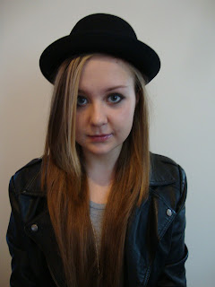
I like this image because my model is looking directlly at the camera, giving the audience a direct mode of address.
I think that this image would be perfect for the cover because there is white space either side of her, this would be perfect space for the sile lines of the articles to go.

I like this image because the smile suggests confidence and love of what she does.
I also like the fact that it is a close up of her because it is more personal.
I would like to use this in the magazine, possibly on the double page spread.

I like this image as it is a mid-shot, showing her body language. I also like how the sun from the window is coming accross her face, it gives her a light side and dark side of her face which could possibly represent her personality.

I like this image as it shows that she does not care what people think about her. She is not looking at the camera, her arms are down by her side and she is biting her lip with slightly raides eyebrows, showing that she is very laid back.
 

Photos For Album Cover...

 
I like this image for an album cover because the candles in the background are very visible and my model is looking down, giving a sense of mystery to the image.

I do not like this image because you can see other objects in the background, the model is also covering the candles behind her, which is a vital part of the image.

The same goes for this image as you can see other things in the background and she is covering the candles.
I do however like how she has her head down and is looking at the camera, I feel that it gives a dark, sinister atmosphere to the photograph.

I like the positioning of the model and the background looks how I wanted it to, however the image is slightly blury to use it as the album cover.

Photos From Shoots...

Model 1 (Cover Star):
 
Model 2 (Band Manager):

Model 3 (Another Artist Featured):

Friday, December 7

My Cover Artist's Style...

Looking at the 'rock chick' style I have made an image board to show the kind of image I want my cover artist to have. I have chosen more than one outfit because I want photographs with different outfits in them. I have also shown how I want to style my model's hair, makeup and what kind of accessories I want her to be wearing. I will use these images as inspiration when choosing the clothes for the photoshoot, but will try and get her image as close to this as possible.

Tuesday, December 4

My Models...

So far I have chosen three models to appear in my magazine.
The first is my friend Molly who is going to be the cover artist for my music magazine. Although she does not fit the stereotype of a typical rock artist, I am going to give her a makeover so I can give her the image that I pictured my cover artist to have.
The second is going to be my brother, as he is a DJ himself I feel that he will be a good model as he is already familiar with the music world.
The third model is going to be my dad, although he does not look like a music artist I feel that he would be good to feature either as a band manager on the cover or on the contents page as a character from an upcoming movie or television show.

Saturday, December 1

Iconography Associated With My Genre...


Locations...

Looking at examples of music magazines I have noticed that the majority have a clear background for the cover photo, so for my cover I will be using a plain background. It will not be an issue for me to find somewhere with a plain background because I can use the plain white wall in bedroom, I am also using white because the colour scheme of magazine is going to be white, red and black, so the background will be white and the text will be red and black. For the two page spread I will keep the smae background but change the colour of it in photoshop. I will change it to either black or grey, this will give the images some variety.

Analysing A Contents Page 2...

Mojo:
The word 'Mojo' has been used at the top of this page making it quickly recognisable. The word 'Contents' has not been used at the top but it is obvious that it is one because of its coventions such as listed articles and their page numbers at the side.

The main colous that have been used on this page are red, white and black. But also other colours are included in the images and since the images take up a lot of the page there are is not really a specific colour scheme which is good for the readers as it is not gender specific and is fun and interesting for them.

The fonts that have been used are bold and clear to read, the title 'Mojo' is the largest and most bold showing that it is the most important. The descriptions of the articles are in ittalics showing that they differ from the rest of the text. The main articles are are bolder than the descriptions because they are more likely to be read.

On this contents page their is not a main image that is concentrated on, instead there is a variety of different photos on the side that realate to the articles. This shows that all of them are equally as important and readers aren't just buying the magazine for the one main article on the cover. Not all of the images at the side are corresponding to an article in the middle, this will give the reader a sense of suspension as they do not know what they are about to read about.

The layout of this page is fairly neat and straight forward, so as not to overwelm the reader. It is clear and simple, the articles and their page numbers are placed in the middle, the title is at the top of the page and the images are down the right hand side.

Analysing A Contents Page 1...

Q Magazine:
The title of the magazine,Q, has been used at the top of the page so that it is quickly recognisable. 'Contents' has been used at the top to show what is inside the magazine. The issue number is also placed at the top showing that it has sold lots of copies and collectors of the magazine can quickly identify if they have missed an issue or not.

The colours that have been used for this contents page are red, white and black. These colours are well suited to this magazines genre, as red and black are usual colours assosiated to rock. The white tones down these colours making it still rock like, but more so that anyone can pick up in shops and be able to read and relate to. These colours are used all throughout this magazine showing continuity.

The font that has been used is clear and spread out, this is because they want to make sure that anyone can read the magazine and they do not want to choose a particular style that will only suit certain types of people. This is broadening their target audience.

The use of images has been used well here. The largest photo is of Matthew Bellamy, the lead vocalist of the band Muse, showing that they are the main feature in the magazine. Other photos have been tilted slightly to one side giving the page more character, it also shows that rock stars are quite laid back and not neat or organised. I like how the photos have been labelled with their article page number, this would make it easy for the reader to quickly find the page they want to look at. The colours in the images are not distracting from the colour scheme used throughout the magazine, it would have been really off putting if Mat Bellamy was wearing bright pink or alluminous yellow.

The layout of this page seems fairly neat but some of the photos have been tilted to one side slightly revealing a laid back feel that people can relate to.

Conventions Of A Music Magazine Cover...